
Kitopi was founded in Dubai in 2018 by Mohamad Sami Ballout, Saman Darkan, Bader Ataya, and Andres Arenas.
The four founders came from consulting backgrounds and saw an opportunity to help restaurants expand their delivery operations without the cost of opening new physical locations.
Kitopi started as a managed cloud kitchen platform. It provided restaurants with kitchen infrastructure, trained staff, and technology, allowing owners to focus on food, marketing, and dine-in operations.
Kitopi has expanded into a tech-powered multi-brand restaurant company with a growing portfolio of food brands, its own technology, and operations across multiple markets.
That evolution is also visible in its branding. Kitopi has built an identity that brings food, technology, people, and innovation together while giving its individual restaurant brands room to develop their own personalities.
Table of Contents
Brand Strategy
1. Positioning the brand
Kitopi started as a managed cloud kitchen platform that helped restaurants expand their delivery operations through shared kitchen infrastructure, staff, and technology.
Technology became a core part of that model through the Smart Kitchen Operating System, or SKOS, which Kitopi developed to optimize kitchen operations in real time and improve utilization.
Kitopi has since expanded into a tech-powered, multi-brand restaurant company and now operates its own portfolio of food brands alongside its technology platform.
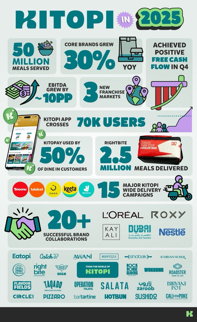
Kitopi’s evolution is not just a change in how the company describes itself. Its 2025 results show how far that strategy has taken the business. The company served 50 million meals during the year, while its core brands grew by more than 30 percent year on year. It also became free cash flow positive in Q4 and improved EBITDA by 10 percentage points.
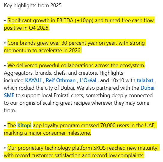
Here’s what Kitopi achieved in 2025:
2. Purpose and personality
Kitopi’s purpose is to “satisfy the world’s appetite to create joy.” The company also describes itself as a creator of magical food experiences that discovers, creates, and curates homegrown brands from the region, for the region.
Its communication reflects that positioning through themes such as innovation, pushing boundaries, learning, growth, and employee development.
3. Core brand message
Kitopi’s messaging brings together food experiences and technology.
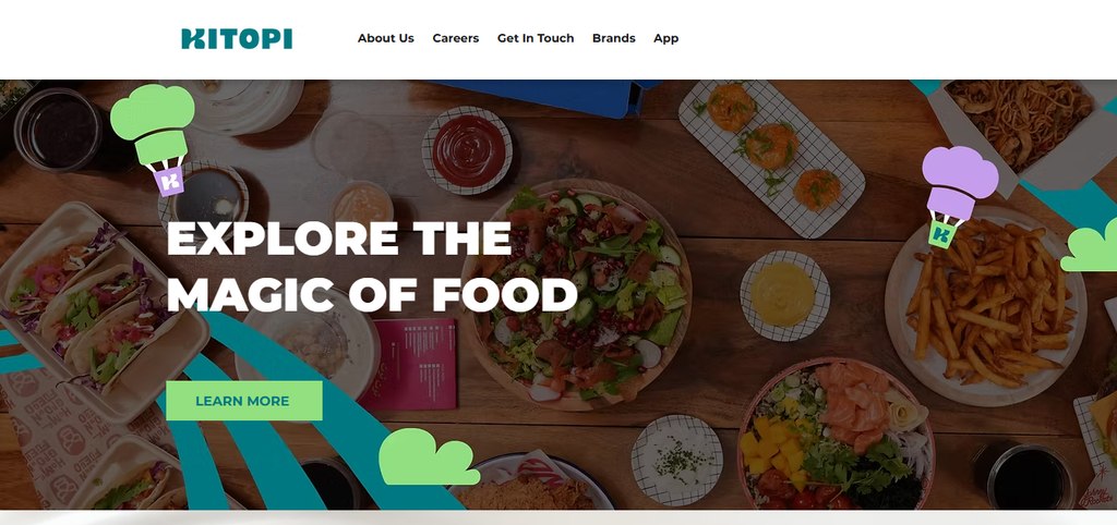
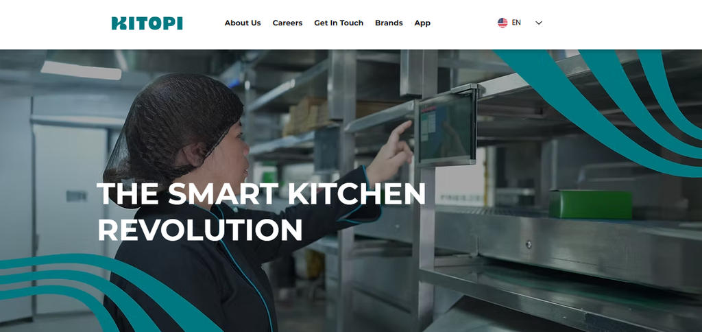
“Explore the magic of food” puts the consumer experience first, while “The smart kitchen revolution” highlights the technology behind the business.
These messages work because they explain two sides of Kitopi without making the brand feel divided. Food is the experience that customers see, while technology is one of the capabilities that helps Kitopi deliver that experience at scale.
Logo and Identity System
1. The idea behind the logo
Kitopi refreshed its visual identity in 2022 with a new logo, color palette, icons, and illustrations. The logo uses a continuous line inspired by the movement and interlacing paths of Kitopi’s everyday operations.
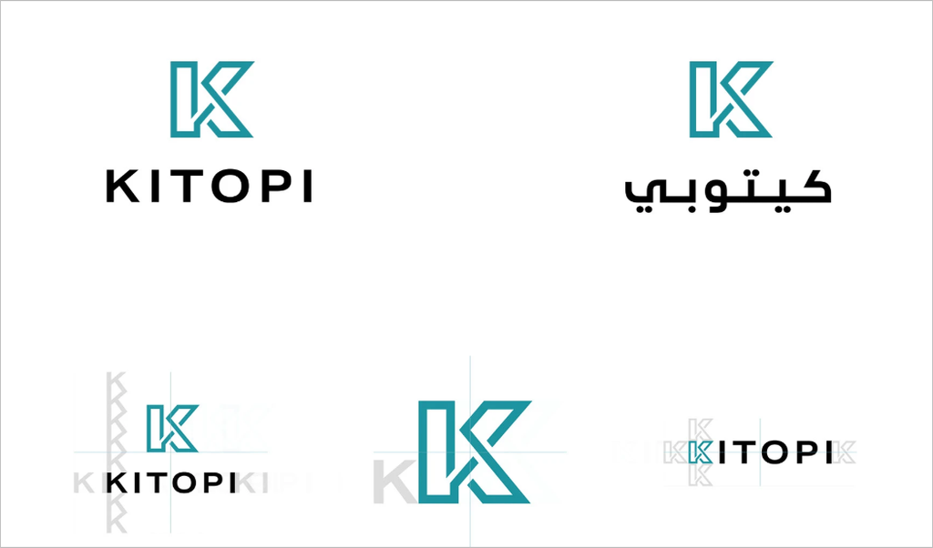
The continuous form gives the mark a sense of movement while also reflecting connection. It offers a simple visual idea that represents a business built around many moving parts.
2. Building a recognizable identity
The logo is only one part of Kitopi’s identity system. The rebrand introduced a broader set of visual assets, including illustrations and icons, to help explain Kitopi’s services and products.
The illustrations use a clean, human tone, while the icons communicate specific ideas and functions. This gives Kitopi more ways to express the brand across different types of communication without relying on the logo alone.
Color and Typography
1. Kitopi’s color palette
Kitopi kept its iconic teal when it refreshed the brand in 2022, but expanded the palette with different shades of teal and a few contrasting colors. The broader palette gives the identity more range while keeping teal as the recognizable visual anchor.
Lighter teal shades create softer variations of the core color, while orange, coral, black, and white add contrast across different brand applications.
2. Kitopi’s typography
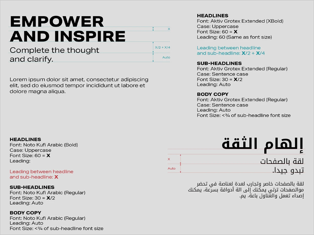
Kitopi uses Aktiv Grotesk Extended for English and Noto Kufi Arabic for Arabic. The rebrand describes the type system as strong but neutral, allowing the typography to support the message without overpowering it.
Aktiv Grotesk Extended also gives Kitopi’s headlines a distinct visual presence, while Noto Kufi Arabic extends the identity consistently into Arabic communication.
Visual Language
1. Illustrations and icons
Kitopi’s refreshed identity introduced a new set of icons and illustrations. The icons use simple black line drawings, including takeaway containers, food delivery vehicles, and hand-related symbols.
The illustrations take a more expressive approach, combining hands, cooking utensils, food elements, and delivery imagery with simple geometric forms. The style feels playful and active rather than realistic, reinforcing Kitopi’s connection with food, cooking, and delivery.
The two styles serve different purposes. Icons simplify ideas into recognizable symbols, while illustrations give the brand more room to express movement and personality.
2. Food as a visual element
Food remains at the heart of Kitopi’s visual communication.
Its current portfolio includes brands across burgers, sushi, Indian food, Middle Eastern food, Mexican food, healthy meals, desserts, and cafes. Each concept has its own positioning and personality.
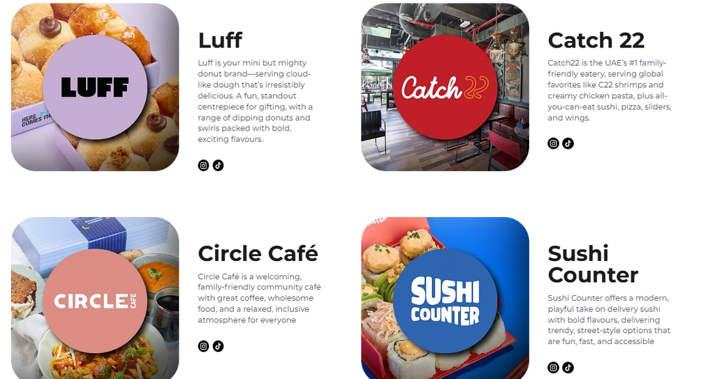
This gives Kitopi a wide range of food imagery to use across its communication.
Food photography brings the consumer side forward, while illustrations and icons explain the technology and operational side.
That balance keeps Kitopi from looking like a traditional technology company.
Brand in Action
1. The website
Kitopi’s website puts food at the center of the experience.
Its main headline, “Explore the magic of food,” immediately communicates what the company is about. Visitors can then explore its story, brands, technology, careers, and other parts of the business.
This approach works well because Kitopi has a complicated business model. Instead of starting with a technical explanation, the website starts with the experience that is easiest for people to understand.
Technology still has a clear place through the Smart Kitchens section, where Kitopi explains its operating system and approach to kitchen operations.
2. Digital products and technology
Kitopi’s brand extends into the technology it builds.
Its Smart Kitchen Operating System supports kitchen operations in real time and helps improve efficiency and utilization.
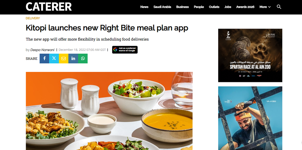
The Right Bite app provides another example. After acquiring Right Bite, Kitopi used its technology to support consultations, nutrition information, meal plans, and delivery scheduling.
These products show that technology is not simply part of Kitopi’s marketing message. It is also part of how the company delivers value to its brands and customers.
3. Restaurant brands
Kitopi’s portfolio is perhaps the clearest example of its brand strategy in action.
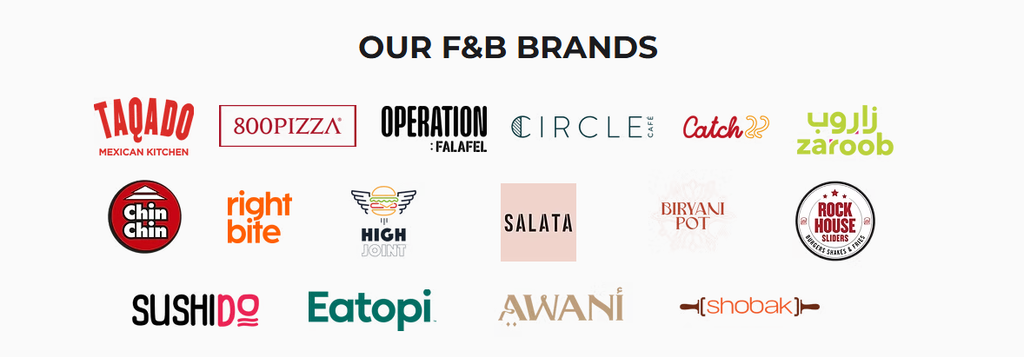
The company operates brands such as Zaroob, Operation Falafel, Right Bite, Taqado, Chin Chin, High Joint, Biryani Pot, Catch 22, SushiDo, Ichiban Sushi, and Circle Café.
Each brand has its own personality.
Zaroob focuses on Levant street food and a lively experience. Right Bite focuses on nutrition and meal plans. High Joint focuses on indulgent burgers. Biryani Pot connects its food with Indian tradition and a more premium experience.
Kitopi does not force these brands into one visual or verbal identity. Instead, it provides the wider capabilities that help them operate and grow.
4. Supporting brands through growth
The Zaroob expansion provides a strong example of this approach.
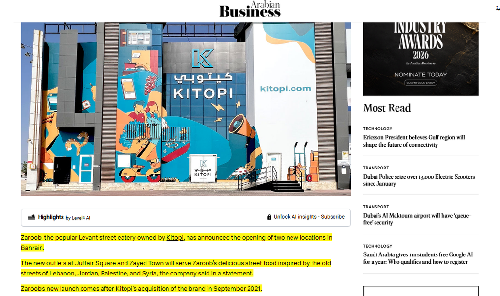
After acquiring Zaroob, Kitopi supported the brand’s expansion into Bahrain while keeping its Levant street food identity. The brand also underwent a complete revamp after the acquisition.
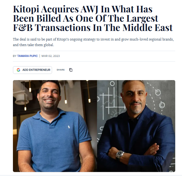
The AWJ acquisition followed a similar model. AWJ retained its original team and operated as a separate vertical while gaining access to Kitopi’s technology and other capabilities.
This shows how Kitopi uses its parent brand to support different consumer brands without taking away what makes each one distinctive.
5. Sustainability and partnerships
Kitopi also uses its brand capabilities through partnerships.
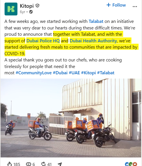
Kitopi also used its food operations to support communities during the COVID-19 pandemic. It worked with Talabat, with support from Dubai Police and Dubai Health Authority, to deliver fresh meals to communities affected by the crisis.
The initiative showed how Kitopi could use its kitchens and chefs to support communities beyond its usual customer base.
Its partnership with Fresh On Table connected local sourcing with technology by using real-time data to track food miles and carbon impact. The partnership also helped Kitopi expand its menu using locally sourced ingredients.
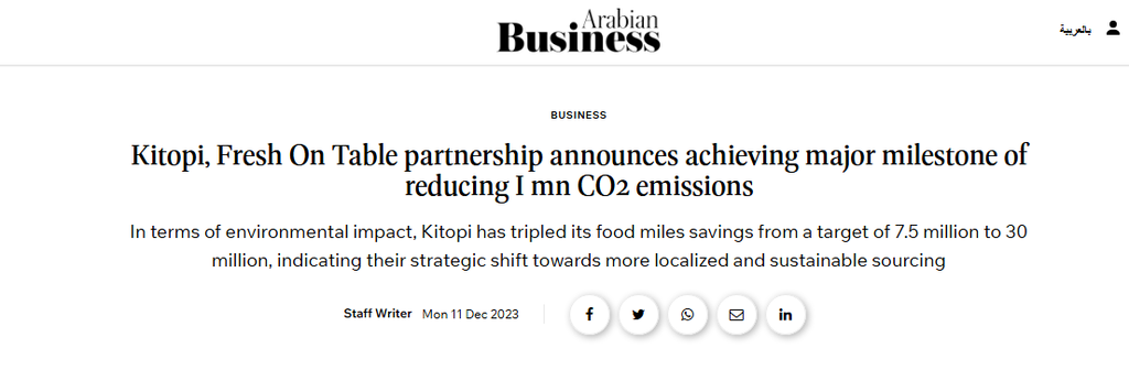
The reported emissions figure in the source comes from company and partner reporting, so treat it as a reported claim rather than an independently verified result.
Key Lessons
1. Build around an idea, not a business model
Kitopi’s business model has changed, but its core idea around creating food experiences has remained relevant. That gives the brand room to move into new formats without redefining what Kitopi stands for each time.
2. Turn the brand promise into an experience
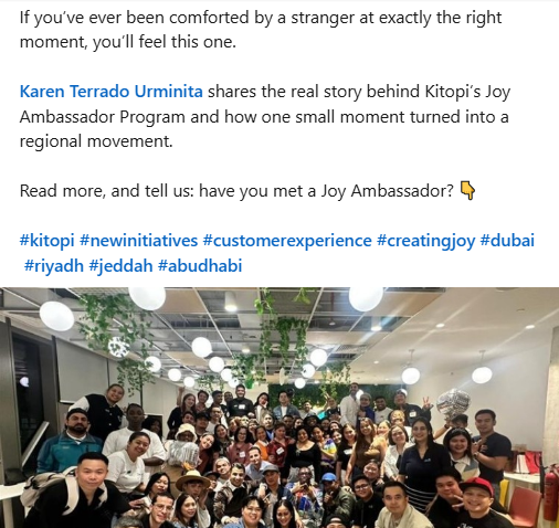
Kitopi’s Joy Ambassador Program shows how a brand purpose can move beyond communication. The program trains selected frontline employees to identify opportunities to create meaningful customer moments, guided by four intended experiences including Trust, Happy, Loved, and Wowed.
This makes “create joy” something employees can act on rather than simply a line in the brand strategy.
3. Give portfolio brands room to own their identity
Kitopi’s approach to brands such as Zaroob, Right Bite, and High Joint shows that a parent company does not need to make every brand look or sound the same. Each can keep its own positioning while benefiting from the wider business.
4. Turn technology into a visible part of the experience
Kitopi does not treat technology as a separate corporate story. SKOS powers kitchen operations, while products such as the Right Bite app bring its technology directly to customers. This makes the technology easier to understand through what it enables.
5. Build a system, not just a logo
Kitopi’s identity works through its logo, typography, colors, illustrations, and icons. The individual elements become more useful when they work as one system across different brand touchpoints.
6. Keep the message simple as the business grows
Kitopi operates across food brands, technology, kitchens, and partnerships, yet its central message remains connected to food and creating joy. That gives audiences a simple way to understand a business with many moving parts.